
What's so good about this website?
Content Aspect:
First of all, Brandon Chesbro is a brilliant photographer. His website is made for his business purposes, and to show off his work. His audience are the customers who are preparing for a wedding. His website is made to impress those who are looking for a wedding photographer. The information provided is not much what you expected, but it is straight forward. And you would be content with what you have.
For example, his pricing section is small but it has everything you need to know.
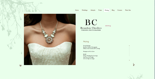
His website does have a lot of pictures, more pictures then information. But they aren't necessarily bad because they "distract" you. I think the designer made it on purpose in order to awe you. After all, this website is made for the customer to be convinced into hiring Chesbro. It is his portfolio.
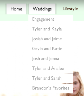
I think this website is great how it is. It looks simple, and is simple to use. The headers are a great size, they are easy to spot. And the "roll down" menus are easy to navigate. They aren't full of description, but they work effectively just like a huge header that has more information. The content the website has does not distract nor does it confuse people. He doesn't show content that has nothing to do with the purpose the website has.
This website does in fact have music, but it is not distracting at all. It's soothing and goes with the feel of the website. It also has a tab which you click in order to see his blog, which is powered by Tumblr another Social Network. The dates which show when the content was updated is not shown. I believe his website isn't updated constantly, but it is recent photos in his portfolio.
This website, at least for me, makes me want to come back in order to see new content. Plus, his photography is amazing. Why wouldn't you want to visit again?