
Design Aspect:
The design of this website is quite simple, yet the way it has been placed and designed it seems very sophisticated. The contrast between the fonts, background colours are easy to see.For example, the "BC" above the photographer's name and underneath his name the "Wedding Photographer".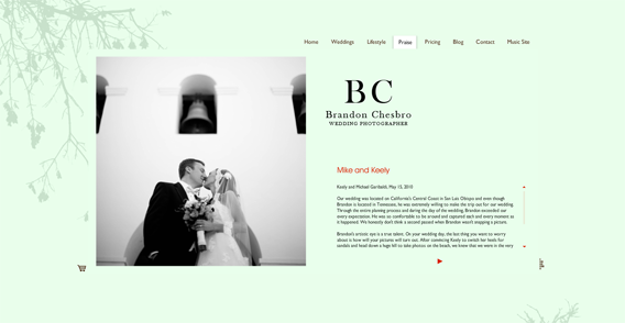 It goes from biggest down to smallest. The use of alignment is obviously there. They used all the basic alignments except for Justify.
I really like the use of Contrast with the background colours and font colours. Your eyes don't strain when you look at it. The font colour is perfect for reading the size is also great. And since mostly people who are interested in wedding photography are "young", the audience is young.
 And they don't need the font to be gigantic in order for the "older" audience to read the words. What I also really like about the site is that you don't have to scroll down in order to see everything. The size of the website is big enough for you to see everything. The texts are put into a scrolling box but it isn't much work to scroll down.
This website does include a home link, but it doesn't have a Site Map nor does it have a search box. I love the way the menu's are down, he used drop-down menus and a jumping type hover box.
Overall, the design is simple, sophisticated and quite easy to use. It's not a deep website which is good, because it is straightforward.